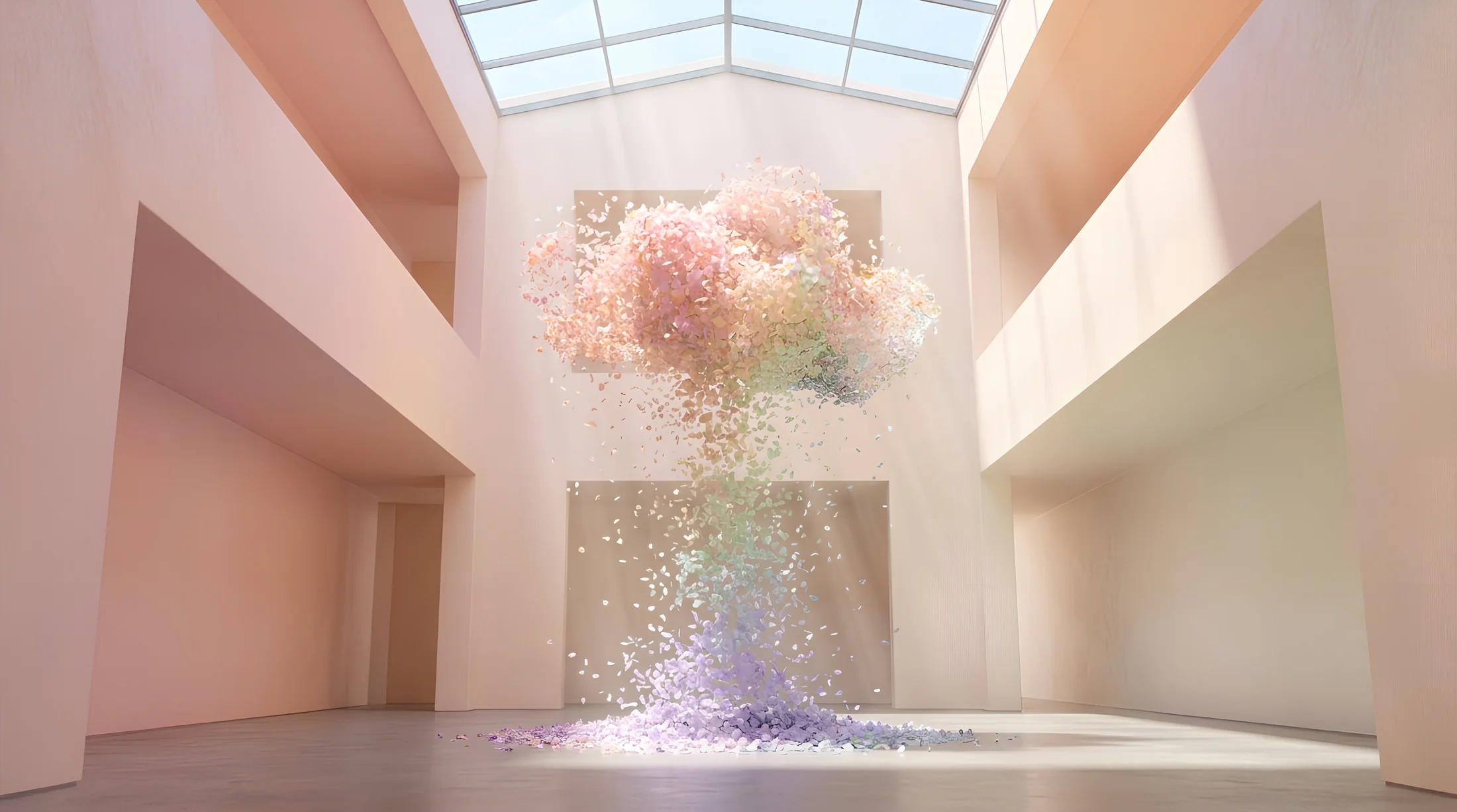
In the contemporary design landscape, colour is changing function. It is no longer an aesthetic choice. It is no longer a matter of trends.
According to NCS – Natural Colour System®, one of the main international references in colour research, colour evolves towards a new dimension: it becomes a design tool to build the atmosphere of spaces. The Colours Beyond 2027+ study arises from an international network of experts in colour, materials and design. And it no longer talks about choosing a colour: it defines how a space is perceived.
Three colour areas, three ways of designing space
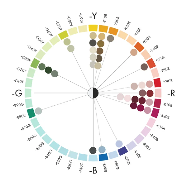
The Colours Beyond 2027+ research by NCS identifies three colour areas (Dull Pale, Pale and Dark), each expressing a different approach to the environment. They are not palettes. They are design structures.
Each area reflects a precise cultural shift: a greater need for clarity, a return to tactility, the search for a more authentic and conscious expression
The result is a new way of understanding colour, where light, matter and surface work together to generate atmosphere
For each colour area, combinations are developed according to the 60-30-10 logic. These are not decorative schemes. They are tools to build visual and atmospheric balance.
spatial base
0%
support element
0%
accent
0%
These proportions show how atmosphere does not arise from a single colour, but from the relationship between surfaces, materials and light.
Colour as experience
Trends beyond 2027 indicate a clear direction
Colour becomes an integral part of the spatial experience. And for those working on surfaces, this means one precise thing: the finish does not complete the project, it defines it.
1. less colour as an isolated element
2. more colour as a system
3. less decoration
4. more perception
From palettes to atmospheres: what really changes
To understand the scope of this change, it is useful to compare the NCS 2026+ model with the 2027+ one.
Dusty and desaturated tones, with low chromaticity, that introduce warmth and identity without generating visual excess.
Decoration without excess
Identity without dominance
Effect in space
Dull Pale tones soften contrasts and create environments where colour is present but never dominant. The perception is soft, layered, and conveys a sense of controlled depth. Space gains character through nuance and the relationship between surfaces, rather than through distinct elements or strong accents. Colour becomes part of the rhythm of the space.
Characteristics
reduced chromaticity
muted tones
balance close to neutrality
material depth
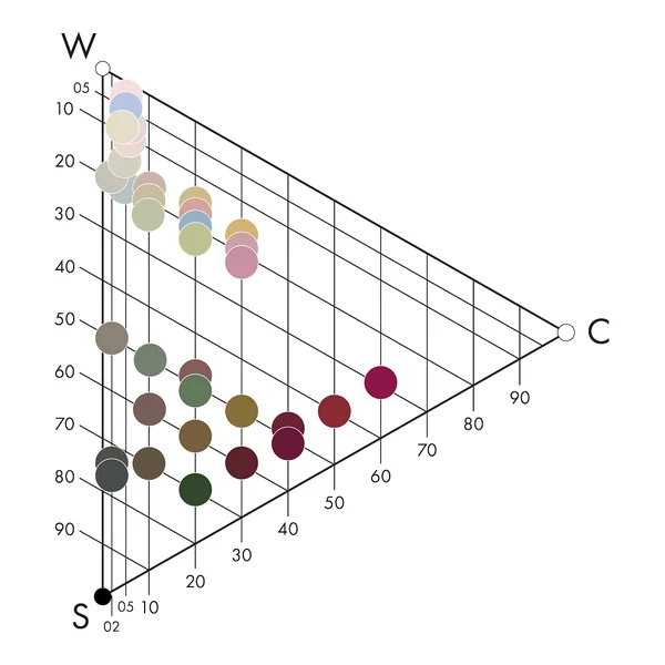
Palette
S 0510-R10B
S 0907-Y90R
S 0907-R10B
S 1005-Y
S 1020-R70B
S 1505-Y
S 2002-Y
S 2005-B80G
S 2010-Y10R
S 2010-Y90R
S 2010-G70Y
Relationship with materials
• recalls natural pigments and clays • integrates with handcrafted materials • enhances textures and surfaces
Applications
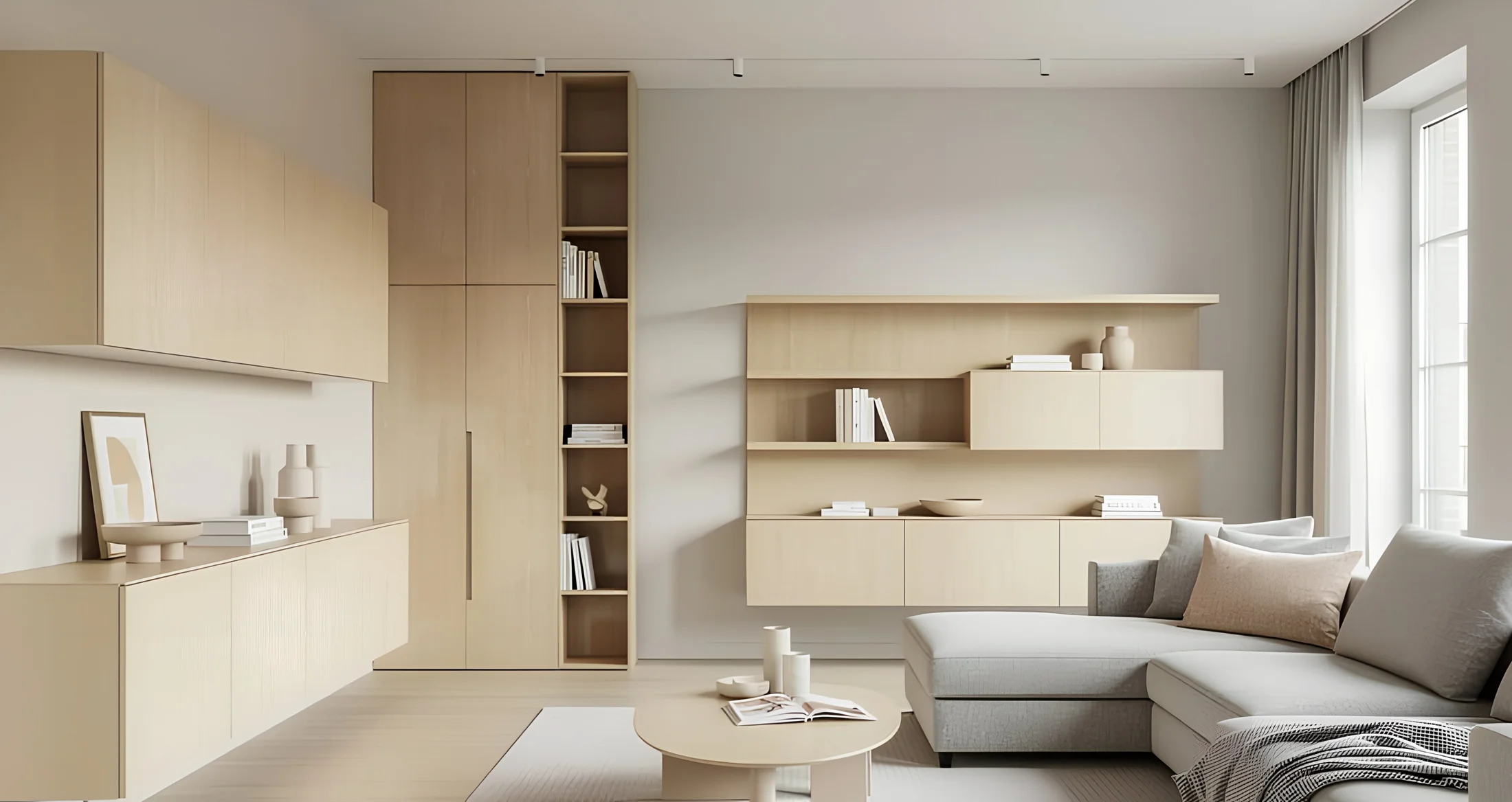
In furniture, Dull Pale finds its ideal application in elements that define the identity of the space, such as sideboards, bookcases, paneling and custom furniture. Slightly pigmented finishes allow wood to maintain a material presence, while colour introduces a refined decorative component. This approach is particularly effective in environments where furniture and architecture merge, creating visual continuity and design coherence.
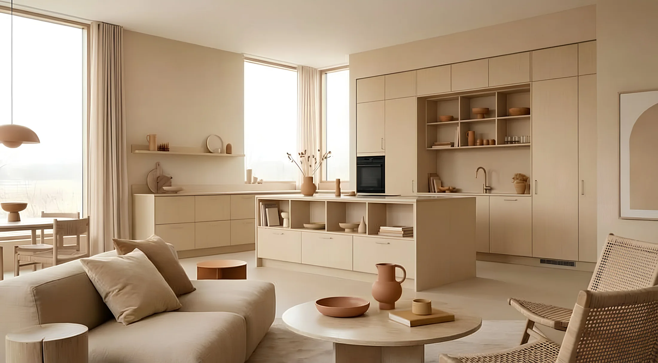
Pale
The colour that opens up space
Light tones, with low to medium chromaticity, designed to diffuse light and create visually open and continuous environments.
Colour that illuminates without invading
Visual openness without cold neutrality
Effect in space
Pale tones amplify natural light and make transitions between surfaces softer and more continuous. Space appears larger, more readable and harmonious, without feeling cold or impersonal. Colour works in the background, accompanying visual perception and promoting a sense of balance and stability. The result is an open environment, but not an empty one.
Characteristics
low black component
contained chromaticity
high brightness
delicate chromatic presence
Palette
S 2020-Y
S 2020-Y50R
S 2020-Y90R
S 2020-R10B
S 2020-R90B
S 2020-G70Y
S 2030-Y10R
S 2030-R10B
S 2030-R20B
Relationship with materials
• lets the material emerge • enhances wood, stone, fabrics and plasters • favours matte and natural finishes
Applications
In furniture, PALE tones are best expressed on large, continuous surfaces, such as wardrobes, kitchens and boiserie, where they help create an effect integrated with architecture. Wood, treated with light or semi-transparent finishes, keeps its structure visible and interacts with colour without being covered. Also in custom elements, PALE allows the construction of discreet volumes that accompany the space without weighing it down.
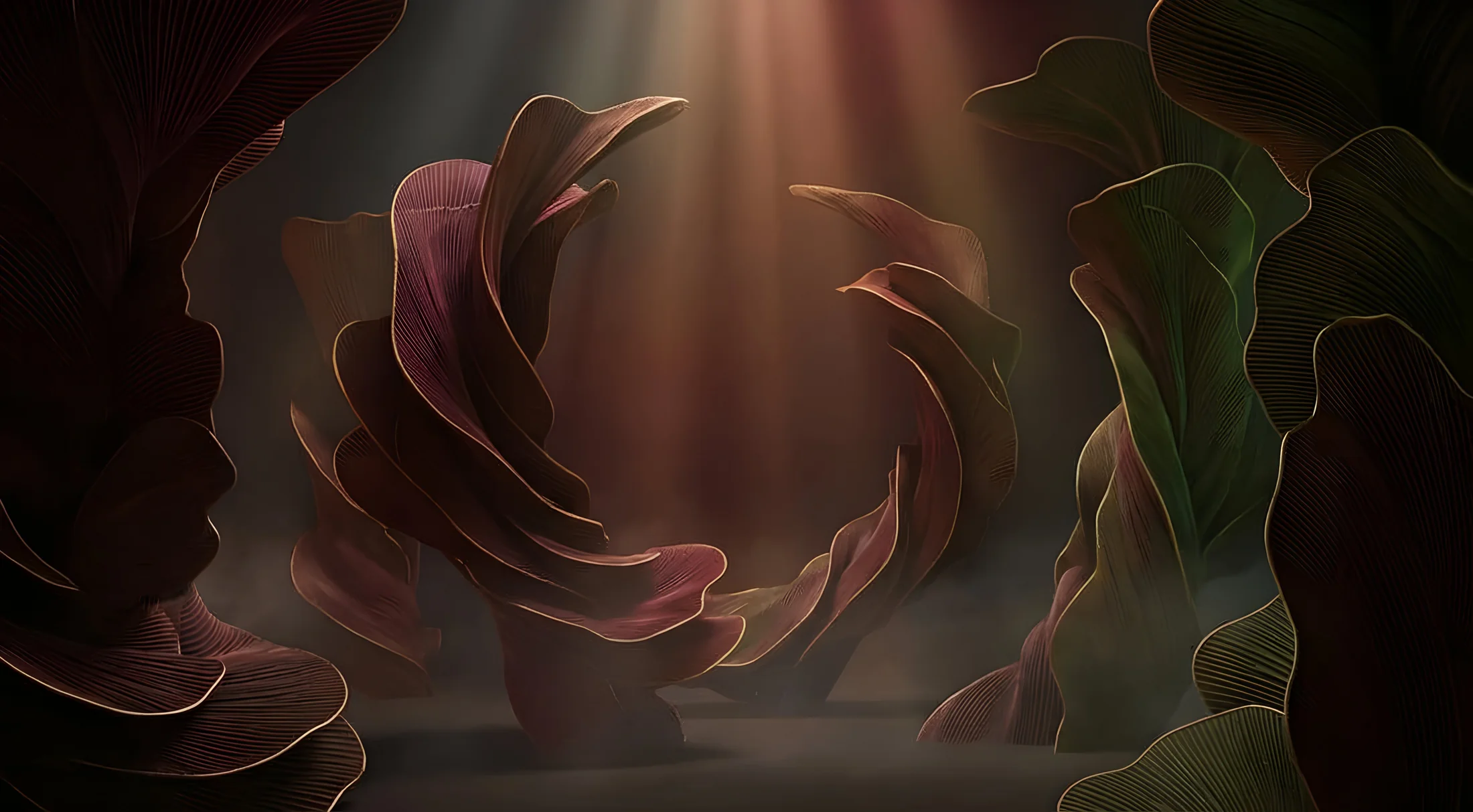
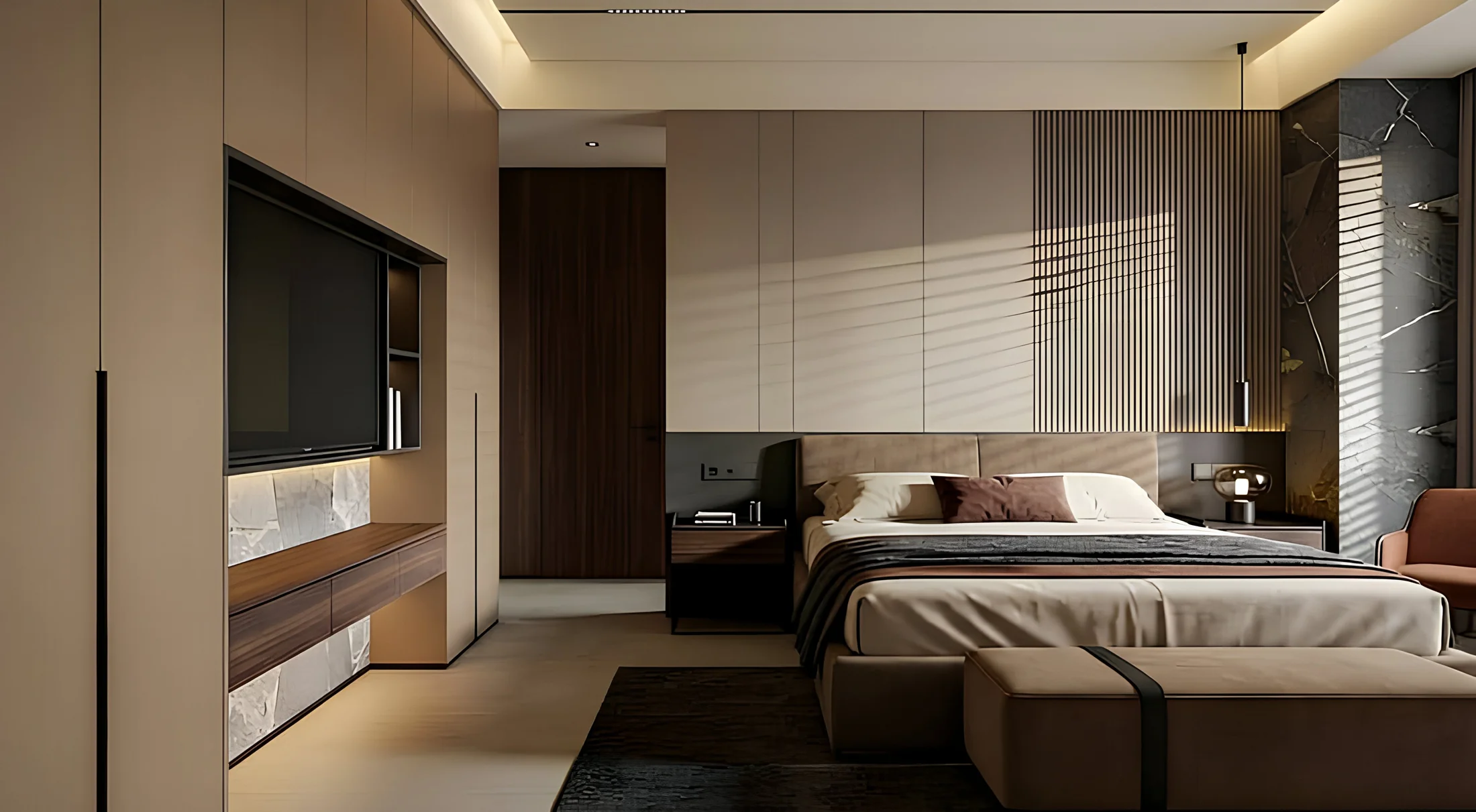
Dark
The colour that gives depth to space
Deep and muted tones that absorb light, emphasize texture and build material and immersive environments.
Depth without heaviness
Material without dramatic excess
Effect in space
Dark tones absorb light and slow down visual perception, making space more intimate and intense. Surfaces gain depth and texture becomes the protagonist, emerging through shadows and variations of light. The environment transforms into a more intimate and sensory experience, in which colour helps define the weight and presence of elements. Space does not expand, it concentrates.
Characteristics
medium-high chromaticity
high depth
strong visual presence
marked material component
Palette
S 3060-R20B
S 4050-R
S 5005-Y20R
S 5010-G30Y
S 5020-R
S 5020-G30Y
S 5030-Y10R
S 5040-R10B
S 5040-R20B
S 6010-Y70R
S 6020-Y10R
S 6030-R10B
S 7010-Y10R
S 7020-G30Y
S 7502-Y
S 7502-B
Relationship with materials
• enhances dark woods and worked surfaces • enhances matte and soft-touch finishes • strengthens tactile perception
Applications
In furniture, Dark tones are particularly effective for elements that need a strong presence, such as kitchens, tables, storage units and wall systems. Dark or pigmented wood, treated with matte finishes, gains depth and character, becoming a central element of the project. Also in paneling and cladding, colour helps create enveloping environments where furniture and architecture merge into a single material experience.
From colour to perception: the role of surfaces
The real change introduced by the 2027+ trends concerns the way colour is perceived. It is no longer just a visual component. It is a physical variable of the environment.
interacts with light
modifies the perception of space
influences sensory comfort
In this scenario, the surface becomes central. And coating takes on a decisive role.
Wood coatings from covering to design tool
In the new chromatic paradigm, the finish can no longer be considered a simple protective layer.
It is what:
defines light rendering
controls colour depth
determines material perception
Wood coating solutions must therefore evolve. They must be able to modulate opacity and reflection, maintain material readability, ensure chromatic stability over time.
From concept to real surface
From colour definition to its application on wood, every project requires technical expertise, material control and knowledge of finishes.
The opportunity offered by Renner Italia
In this context, Renner Italia positions itself as a technical partner for those designing wood surfaces and all materials that define furnishing contexts.
Technologies developed by Renner allow to:
interpret new colour trends with precision
enhance wood material without compromise
achieve advanced aesthetic and functional performance.
Because today, more than ever, colour is not a decorative choice. It is a structural component of the project.
Design colour. Build atmosphere.
NCS 2027+ trends require a change of approach: it is not enough to choose a colour, it is necessary to control its performance on the surface.
Renner Italia supports designers, architects and manufacturers in developing coating systems capable of translating new chromatic directions into concrete, repeatable and durable results.
Do you want to apply NCS 2027 trends to your projects?
Contact us