Cloud Dancer: Pantone Color of the Year 2026

5 December 2025

Pantone has announced Cloud Dancer as Color of the Year 2026. It is PANTONE 11-4201, a soft, airy, and balanced white, chosen to reflect the contemporary need for calm, simplicity, and new beginnings.

While Mocha Mousse in 2025 spoke of warmth and rootedness, Cloud Dancer offers a pause of lightness: not a “sterile” white, but a luminous and gentle presence, capable of giving space and objects room to breathe.

Why Pantone chose white

This is the first time Pantone has chosen white as its color of the year: a decision that feels like a cultural statement.
According to Pantone Color Institute, Cloud Dancer is a high, impalpable neutral that invites us to slow down, focus, and start again. In a time saturated with stimulations, white becomes a new page: not absence, but space for design.
This shade strikes a balance between warm and cool, making it more human than classic optical whites: it is close to natural light filtered through clouds, with a hint of creaminess that makes it livable and contemporary.

A color that is easy to use (and re-use) in interior design

The color of the year is white, which is why it will be easier to find it in the world of furniture and surfaces.
White is already a major feature in homes: Pantone reinterprets it in 2026 as an emotional neutral, capable of accommodating bolder materials, textures, and colors without ever losing its balance.

In interiors, Cloud Dancer works as:
  • a luminous base for minimalist but warm environments
  • a design backdrop for textured palettes (natural woods, light stones, raw fabrics)
  • a bridging color between different elements, from organic design to more technical lines

Cloud Dancer and wood: material lightness

On wooden substrates, Cloud Dancer opens up a fascinating field of possibilities because it illuminates the material.
It is a white that allows you to work on:

  • enhancing the grain in combination with transparent or slightly veiled systems
  • soft-touch and matt effects in a Nordic or quiet luxury style
  • natural contrasts with medium-dark woods, where the white is not sharp but silky

Imagine it on boiserie, custom-made furniture, profiles, and objects: it makes volumes lighter and more contemporary, and dialogues beautifully with the trends of sustainability and formal cleanliness that have been entering design for years.

Matchings and palettes: a white color for socializing

Pantone describes Cloud Dancer as a “scaffold” color, a structure on which to build different moods. In practice, it does not dictate a single aesthetic, but makes them all possible.

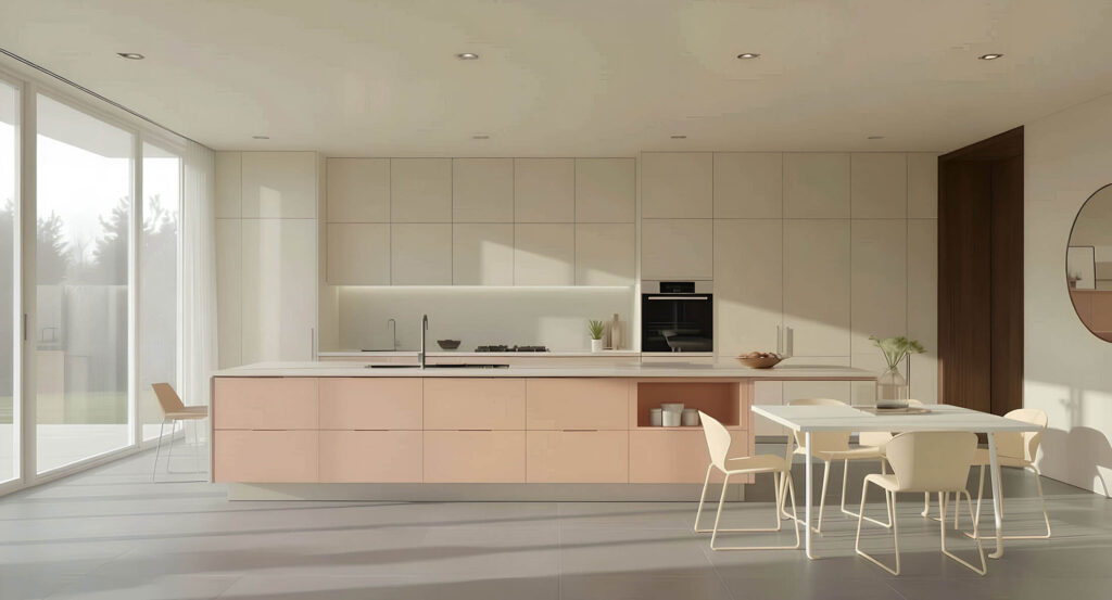
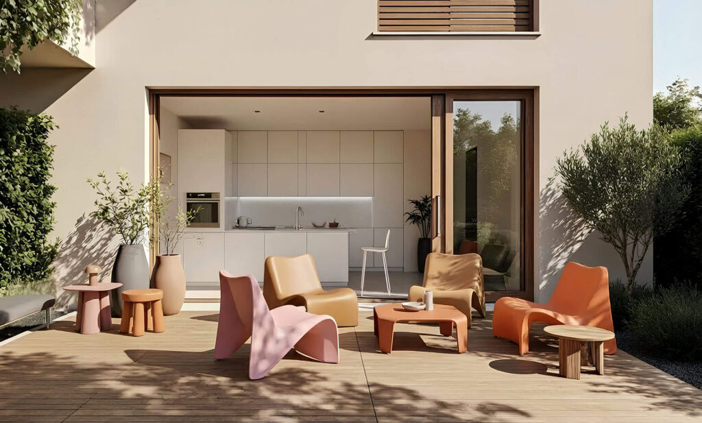
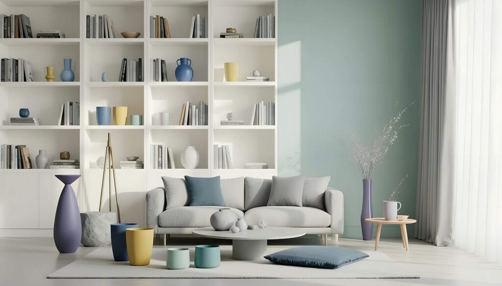
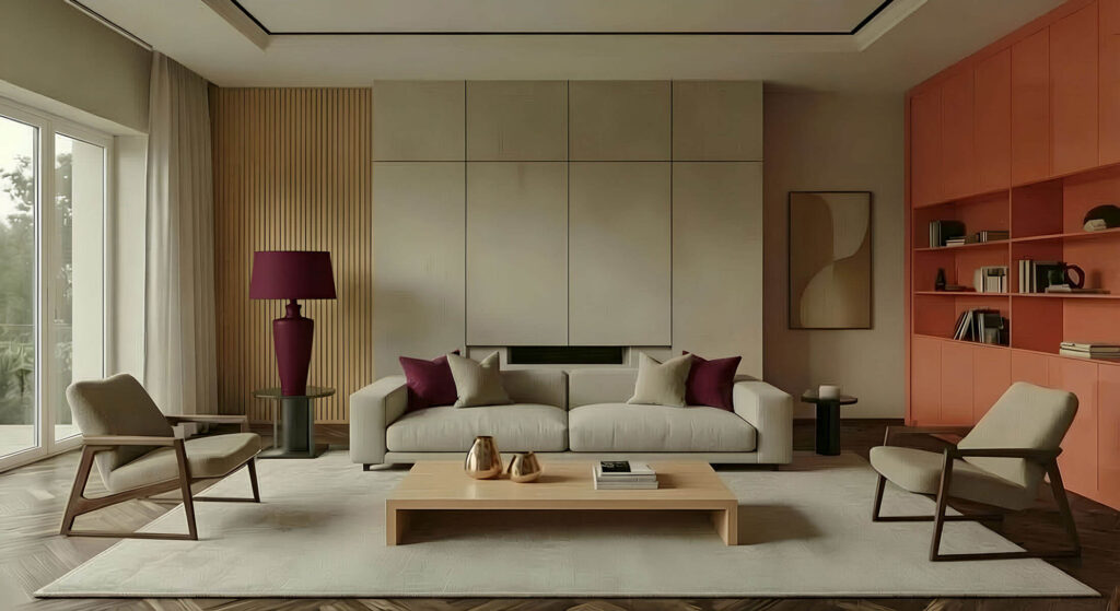
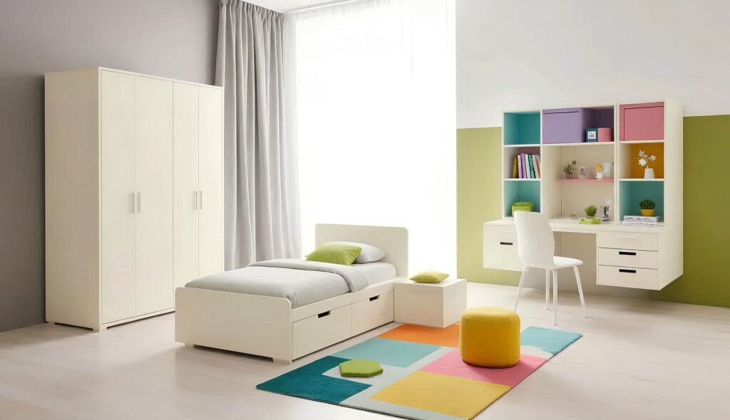
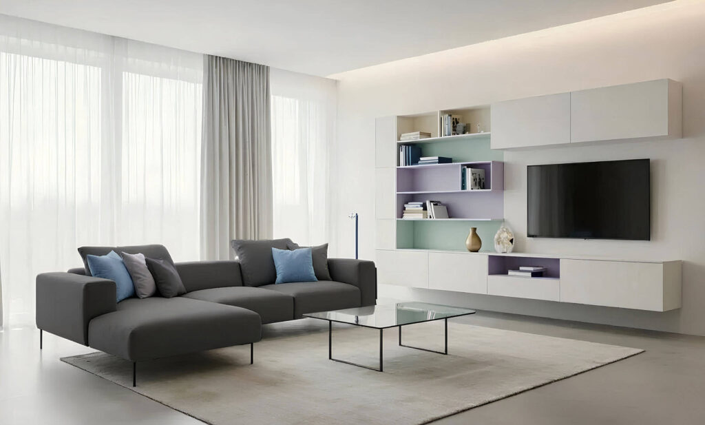
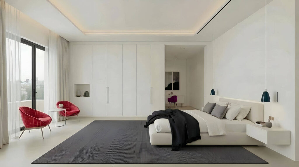
As it does every year, Pantone does not present the Color of the Year as a standalone shade, but includes it in seven “horizon” palettes that explore its personality and potential applications in a way that is ready for use in design, fashion, graphics, and interiors. In 2026, Cloud Dancer is therefore placed in dialogue with the diffused lightness of Powdered Pastels, with the suspended and atmospheric shades of Atmospheric, with the collected and reassuring tones of Comfort Zone, with the more sunny and playful chromatic energy of Tropic Tonalities, with the “gourmand” and enveloping sensuality of Take a Break, with the controlled and deep chiaroscuro of Light & Shadow, up to the most elegant and luminous accents of Glamour & Gleam: seven different but consistent ways of bringing contemporary white to life as an emotional and design foundation, capable of amplifying or balancing any aesthetic language.

POWDERED PASTELS

A soft look for your kitchen with the Powdered Pastels Palette
11-0515 TCX
Lemon Icing
13-4108 TCX
Nimbus Cloud
11-1400 TCX
Raindrops on Roses
11-4201 TCX
Cloud Dancer
13-4306 TCX
Ice Melt
12-1107 TCX
Peach Dust
13-6006 TCX
Almost Aqua
13-3802 TCX
Orchid Tint

TAKE A BREAK

Take a Break is the palette of this garden furniture
15-1040 TCX
Iced Coffee
15-0960 TCX
Mango Mojito
18-1020 TCX
Cocoa Crème
16-1735 TCX
Pink Lemonade
16-0213 TCX
Tea
15-1243 TCX
Papaya
11-4201 TCX
Cloud Dancer
16-1439 TCX
Caramel

ATMOSPHERIC

Modern living inspired by Atmospheric palette
14-4005 TCX
Nantucket Breeze
11-4201 TCX
Cloud Dancer
15-4225 TCX
Alaskan Blue
15-3909 TCX
Cosmic Sky
15-5205 TCX
Aqua Gray
18-4039 TCX
Regatta
14-4912 TCX
Rinsing Rivulet
14-0827 TCX
Dusky Citron

COMFORT ZONE

Comfort Zone is the Palette for this modern living
14-1210 TCX
Shifting Sand
16-1329 TCX
Coral Haze
17-0807 TCX
Mountain Trail
14-1217 TCX
Amberlight
15-0703 TCX
Ashes of Roses
16-1806 TCX
Woodrose
18-1512 TCX
Rose Brown
11-4201 TCX
Cloud Dancer

TROPIC TONALITIES

Tropic Tonalities match well with children bedroom
11-4201 TCX
Cloud Dancer
17-3323 TCX
Iris Orchid
15-4722 TCX
Capri
14-0443 TCX
Kiwi Colada
12-0741 TCX
Sunny Lime
15-1164 TCX
Bright Marigold
17-1755 TCX
Paradise Pink
12-0643 TCX
Blazing Yellow

LIGHT AND SHADOW

The contrasting tones of the Light and Shadow Palette form the basis of this furnishing system
11-4201 TCX
Cloud Dancer
12-6000 TCX
Veiled Vista
14-4320 TCX
Baltic Sea
13-0624 TCX
Golden Mist
16-3610 TCX
Quiet Violet
16-1523 TCX
Cloud Cover
17-5800 TCX
Hematite
18-4218 TCX
Blue Fusion

GLAMOUR & GLEAM

Glamour and Gleam: the palette behind this comfortable bedroom
19-4005 TCX
Stretch Limo
11-4201 TCX
Cloud Dancer
19-1558 TCX
Scarlet Smile
17-1710 TCX
Bordeaux
19-4826 TCX
Dragonfly
20-0188 TPM
Graphite
20-0020 TPM
Satin Slipper
20-0007 TPM
Micron