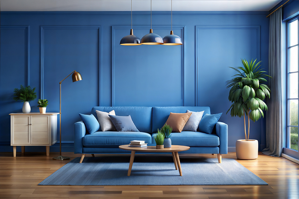
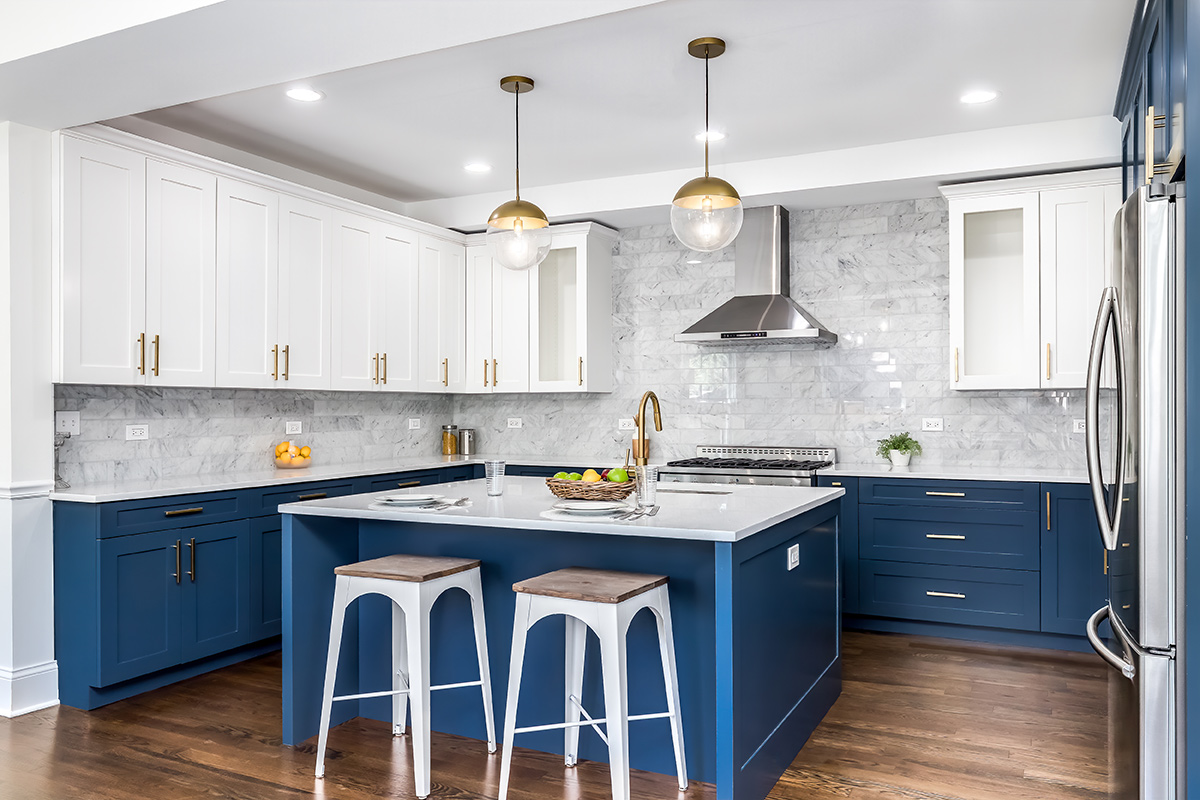
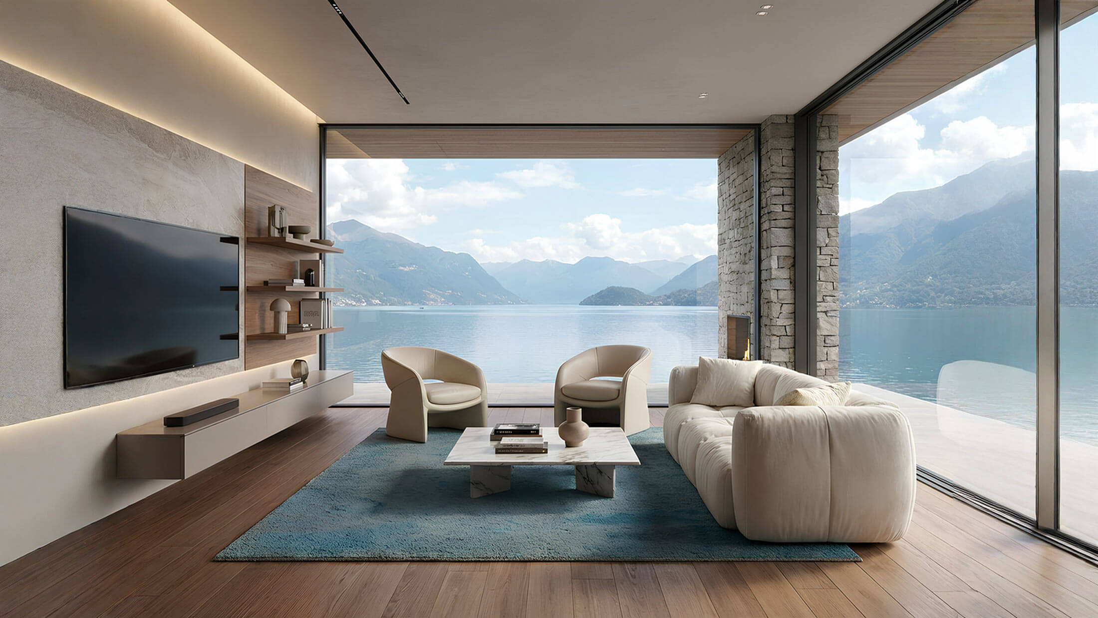
Back to simplicity. Pantone colour of the year 2020 is comforting like a tailor-made dress. Classic Blue 19-4052 is an evergreen and long-lasting shade, recalling the sky at twilight and motivating thoughts, underlining the «desire of a reliable and permanent base on which we can build, while we cross the threshold of a new era».
The Pantone Color Institute, in the age of speed, decided to stop. It chose a relaxing colour that brings peace and calm, offering a safe place. Classic Blue 19-4052 helps to concentrate and supports resilience.
«While the technology keeps on running – said Leatrice Eiseman, executive director of Pantone Color Institute -, it’s easy to understand why we gravitate around colours, which are honest and offer protection. We can interact in total relax with Pantone 19-4052 Classic Blue, a non-aggressive and easily identifiable colour. Recalling the rebirth of a new day, this universal colour is certainly accepted».
In conclusion, we need safety. Instead of the vivacity and eccentricity of the last three years, in which greenery, ultra violet and coral were at the first place, this year the attitude of Pantone Color Institute is for sure more conservative.
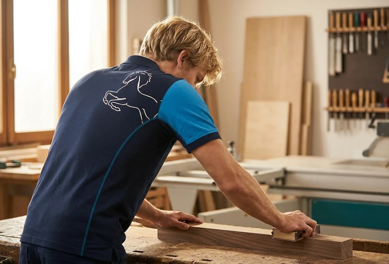
Pantone Color Institute has been selecting the trendiest colour for twenty years. Through this process: researching the fields of art, fashion, design. We must notice that in the world of wood coating it has never had a great success. The trendiest finishings of the main interior designers have always been different from Pantone colours of the year.
Maybe the countertrend choice of Classic Blue 19-4052 can underline a change of direction.
