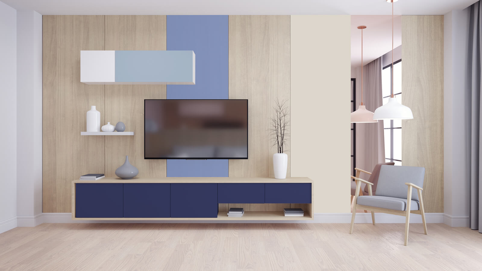
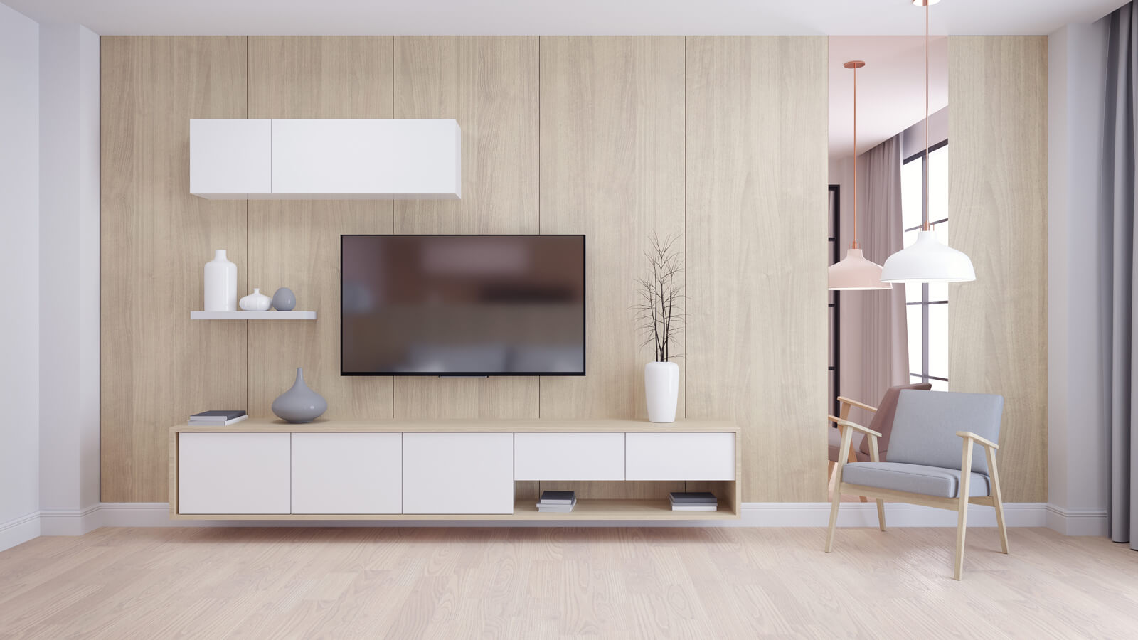
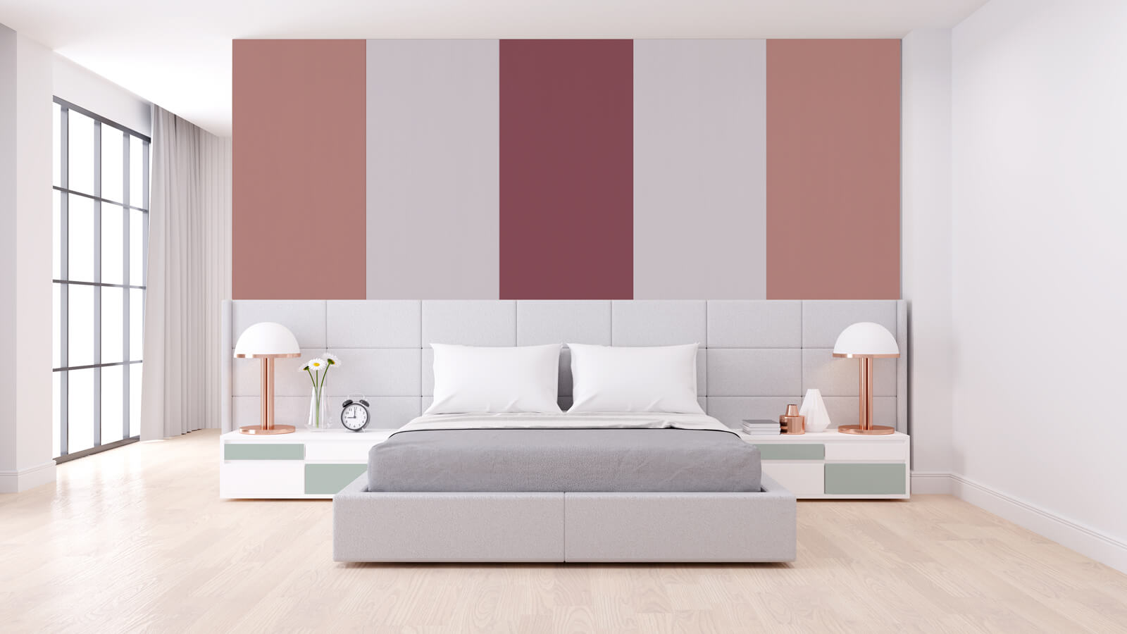
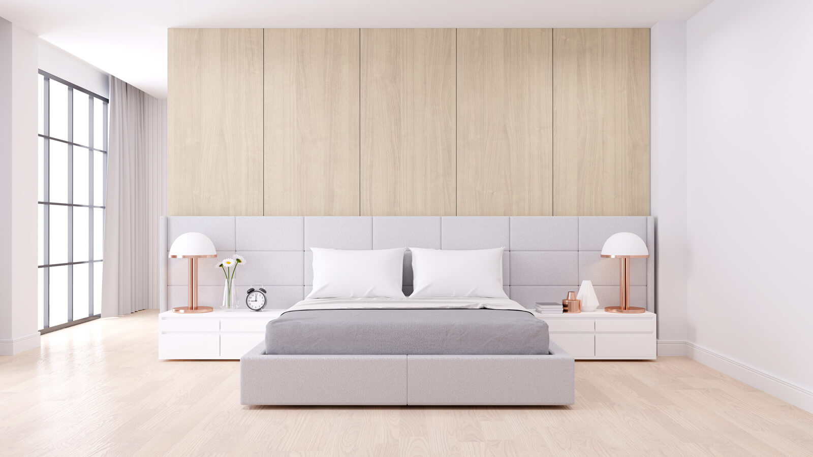
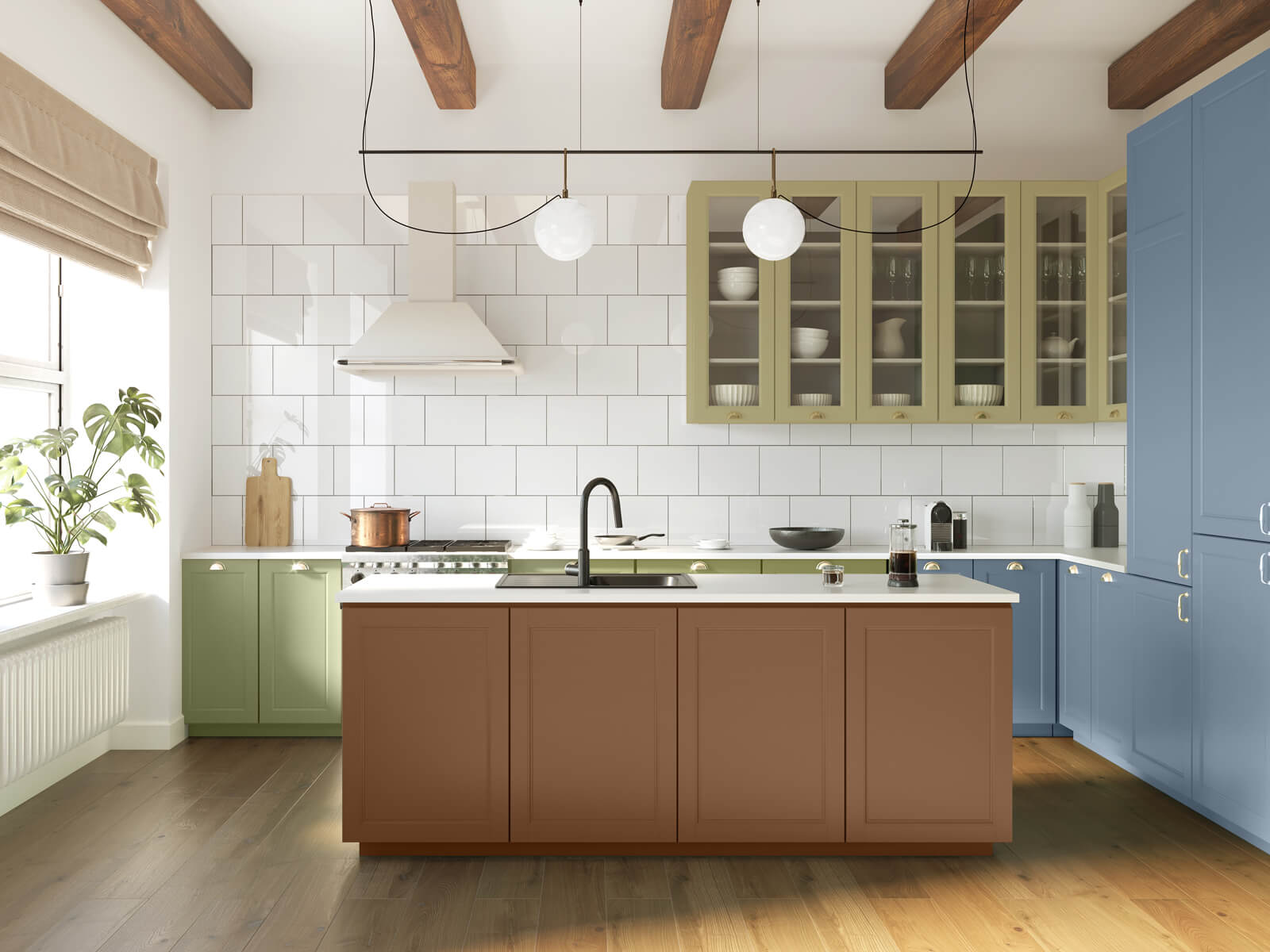
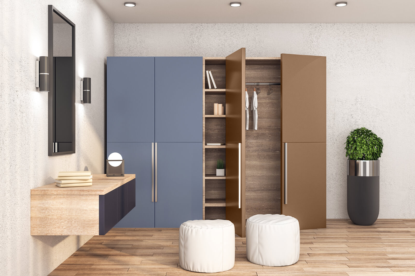
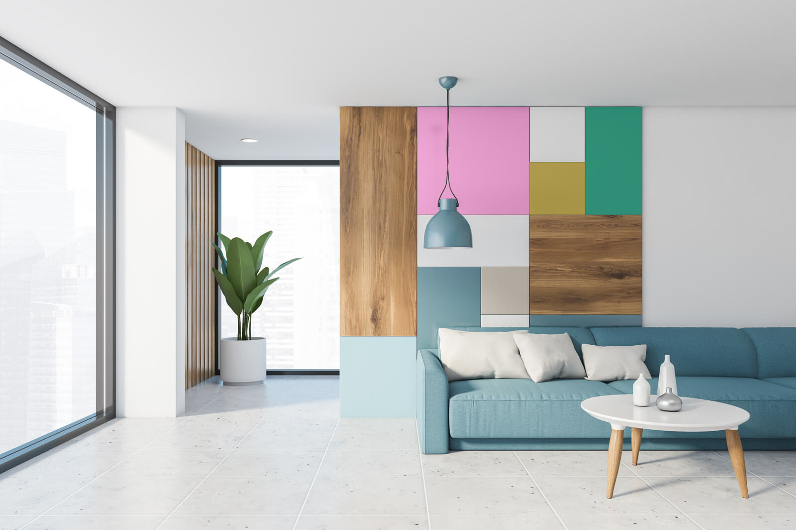
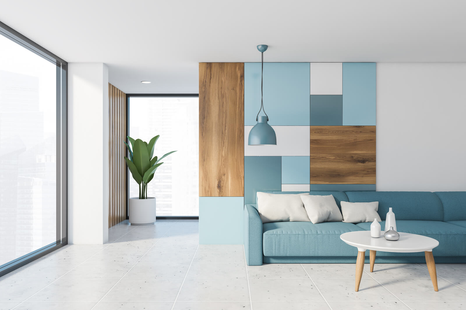
RAL proposes trend colours 2023+ following the line of the immediate past. In fact, three 2022 shades also appear among the 15 nuances, “in order to integrate more easily the existing design elements,” they clarify from Germany.
We are talking about
These last colours are soft and available for all kinds of combinations. The 13 new proposals, in the intentions of the German institute, are functional to so-called ‘phygital’ designs, i.e. those that combine the physicality of materials and the digital experience of the web.
Shades with natural look are inspired by sea plants and clay.
We refer to
Artificial suggestions remember the great improvements and innovations proposed by Metaverse.
We are talking about
A mix full of contrasts, suitable for all tastes. «The market is ready for any colour variation and sustainable design – say the RAL professionals -. Our colour inspirations make it easy to harmonise professional and private space, products and collections for different individuals and groups. They encourage constructive exchange, reducing fears and supporting well-being».
Such in the case of Pantone, another major international player engaged in development and standardisation of colour metrics, also RAL does not give up on its sustainable message: «Preserve resources and work where possible with material colours as well as agricultural and industrial wastes to create attractive-looking pigments».
There is no doubt that colour, as the most influential design element, holds a special place in the design field. According to RAL, colours are an essential element for people and signs of cultural value. They create identity, memorability and atmosphere. They are inspiration from a sensorial and aesthetic point of view. The conscious use of colours is definitively good for everyone.
All the shades can be combined with each other flexibly. We offer inspirational colour profiles for high-quality working and living spaces to help in the decision-making process. Support activity, functionality, sensuality, creativity and regeneration purposefully.
