Spring. Colour trends season at NCS. The Swedish colour maison has chosen the season of awakening to illustrate its colour forecasts to the design world.
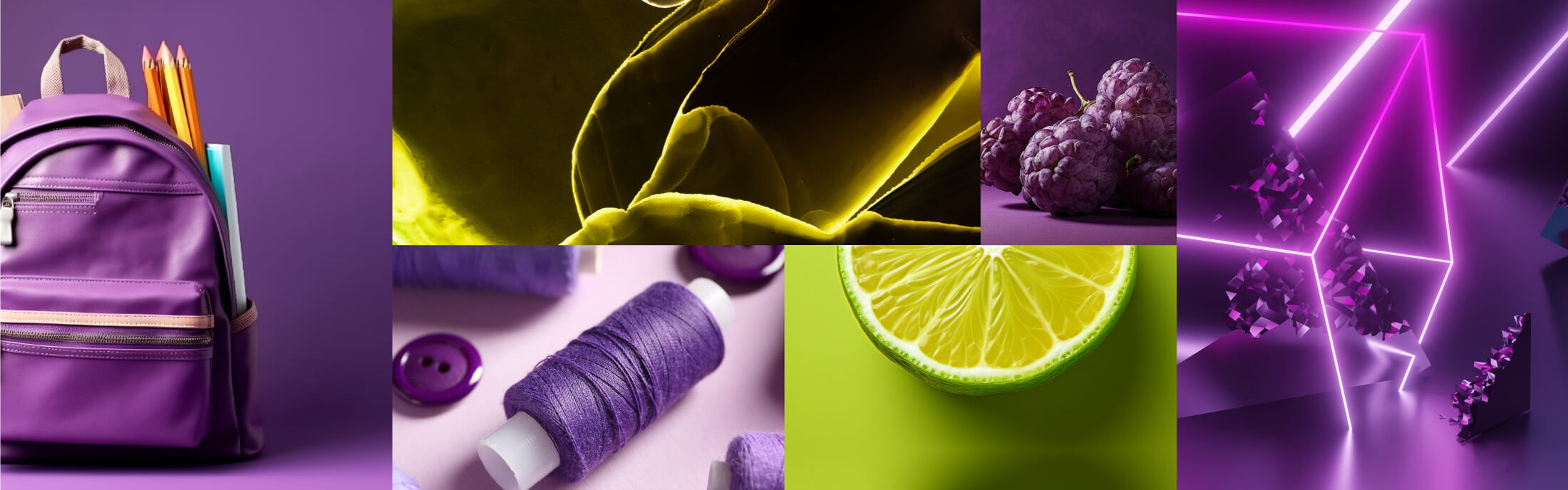
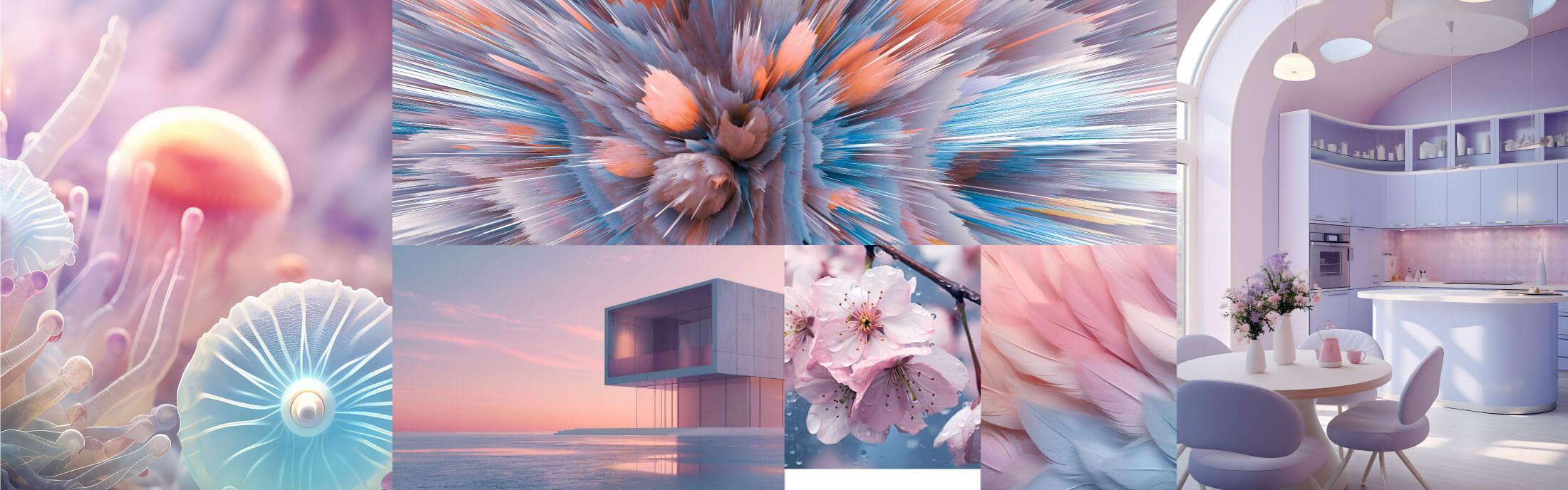
According to NCS, the 2025 of colour will follow four different scenarios: Gaia, On & Off, Inner and Ethereal. Four colour charts to combine shades and inspire creatives.
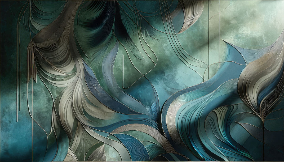
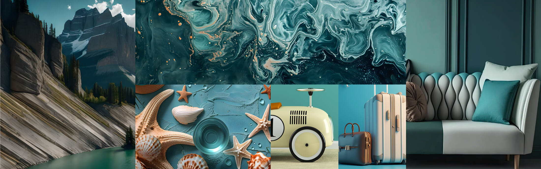
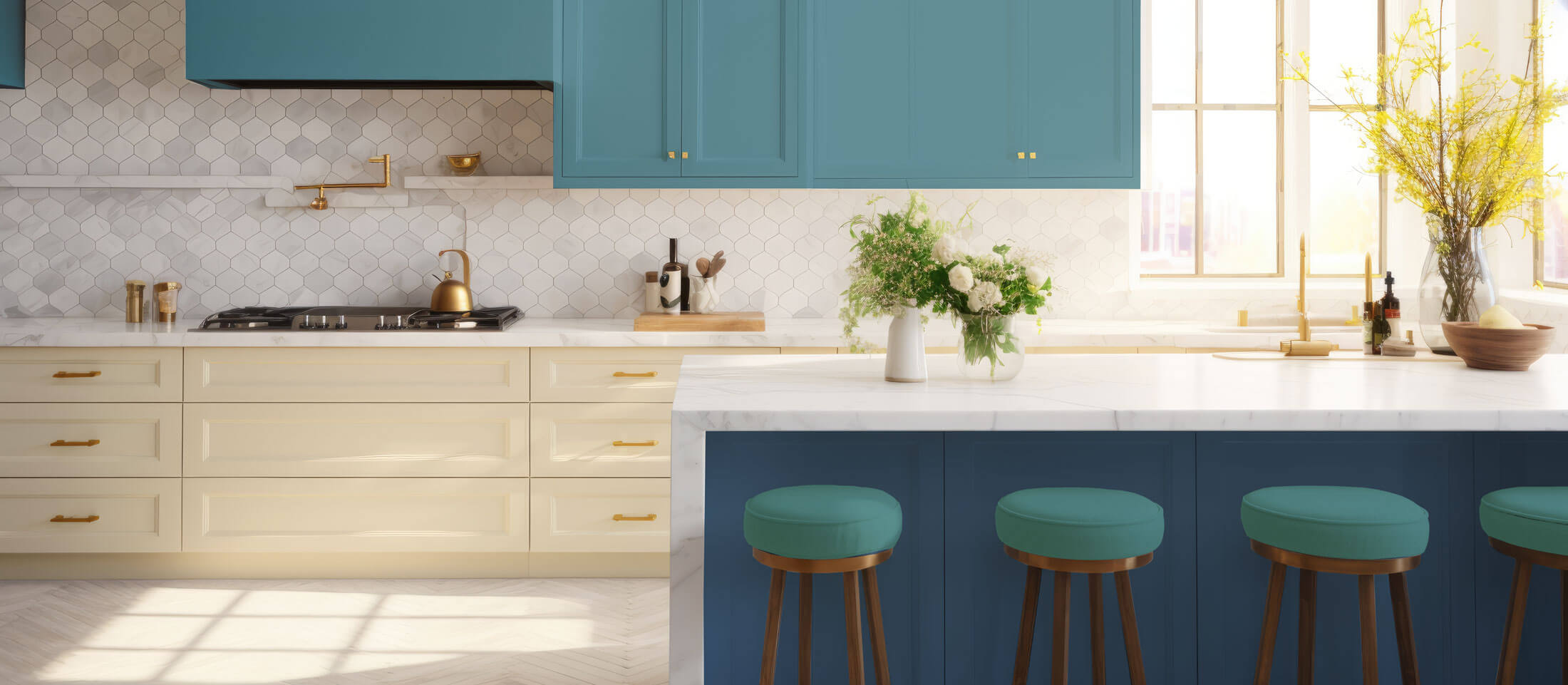
A tribute to the nature and the vital importance of water. In Gaia colour study, Ncs emphasises blue and green shades. The impact of climate change, characterised by rising temperatures and drought, directs the desire towards colours that evoke freshness. This phenomenon stimulates the pursuit of a calming effect.
Desire for freshness
In the past, we tried to bring nature into our homes and looked for a connection with the environment. Now we realise that nature will survive without us.
Gaia's colour chart avoids references to heat and fire. The aim is to create a feeling of freshness, while maintaining the image of our planet as a blue-green entity.
NCS S4030-B10G
A reliable blue that brings silence
NCS S0510-Y20R
The sun shining on the water
NCS S2040-G
An all-embracing and regenerating green
NCS S3030-B50G
A green at ease in both digital and physical
NCS S4030-R90B
A soft, low-tech, nostalgic blue
NCS S6010-B10G
A dark, low blue, stable and quiet
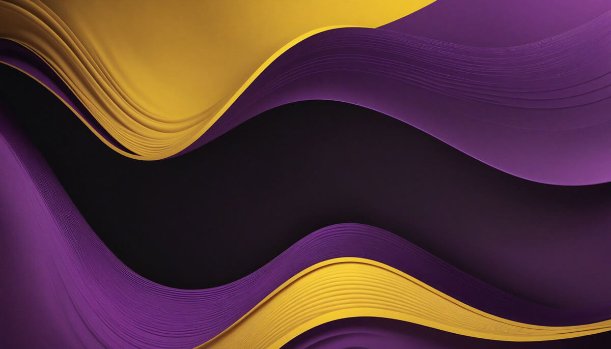
We live in extreme, divisive times. We face multiple simultaneous problems, defined as “polycrisis”. Climate, resources, energy, food, violence. The media amplify this situation. This chaotic scenario results into insecurity. On the contrary, the sense of safety is essential.
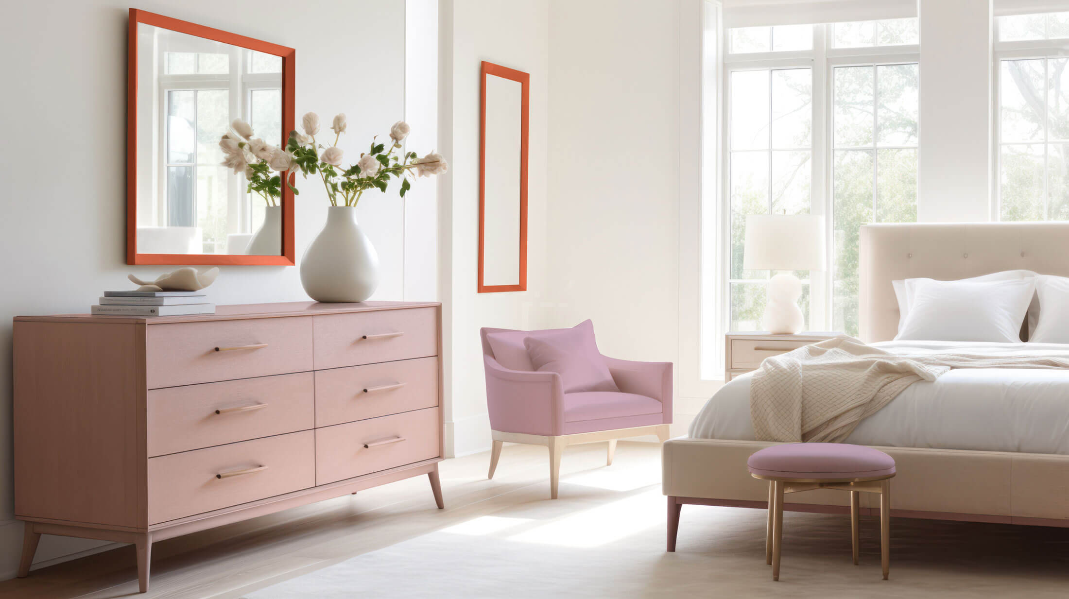
Luxury is safety
The desire for luxury increases in times of conflict and polarisation. We use dark and light colours with low chromaticity to decline comfort. We balance them with powerful and energetic shades. Contrasts in design are important as long as there is a connection. By building colour bridges, we connect and seek unity and hope.
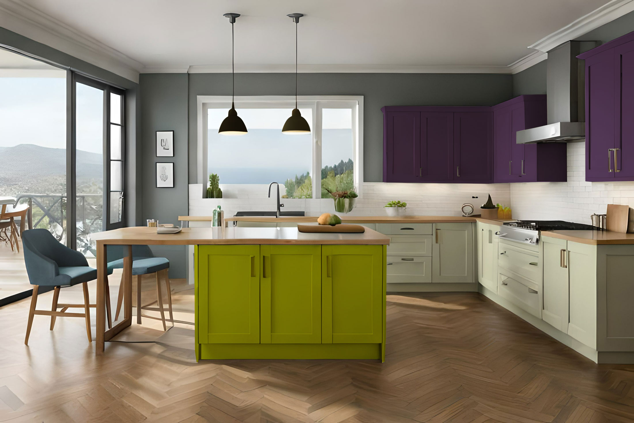
In On & Off the use of dark colours is essential, balanced by light surfaces. This approach aims to connect the two extremes through the use of unified colours. The bright green-yellow stands out in both darkness and light, while a transcendent violet blends with the dark colours, subtly emerging in the light.
NCS S0505-G90Y
An off-white that brings light
NCS S8010-G90Y
A soothing greenish
NCS S1070-G70Y
A young and optimistic artificial green
NCS S5030-R50B
A rich purple that matches dark and light
NCS S8010-R50B
A dark, threatening purple
NCS S1005-R50B
A whitish purple that brings light and trust
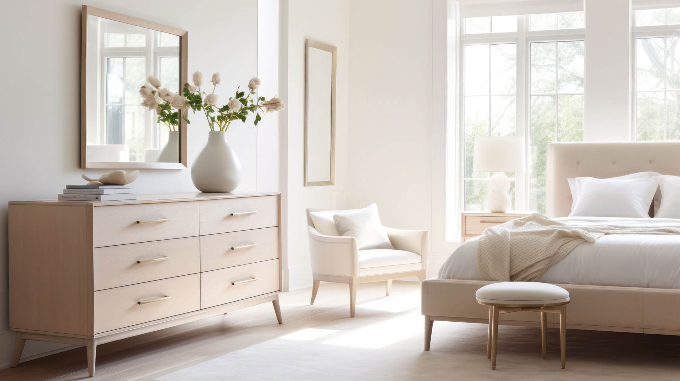
We trust our instincts in a divisive social context. This is reflected in our colour choices, which evoke feelings of comfort, warmth and joy. We prefer medium, earthy and human colours that convey a light but lasting strength.
Detachment from digital for introversion
Outward tensions push us to seek greater understanding of ourselves. Meditation becomes a way to explore our inner life. Craftwork becomes a form of healing. We disconnect from the digital world, seeking authentic sensory experiences and deeper emotional connections. While exploring ourselves, we use neuro-aesthetics as the basis for our design decisions, trying to create wellness projects.
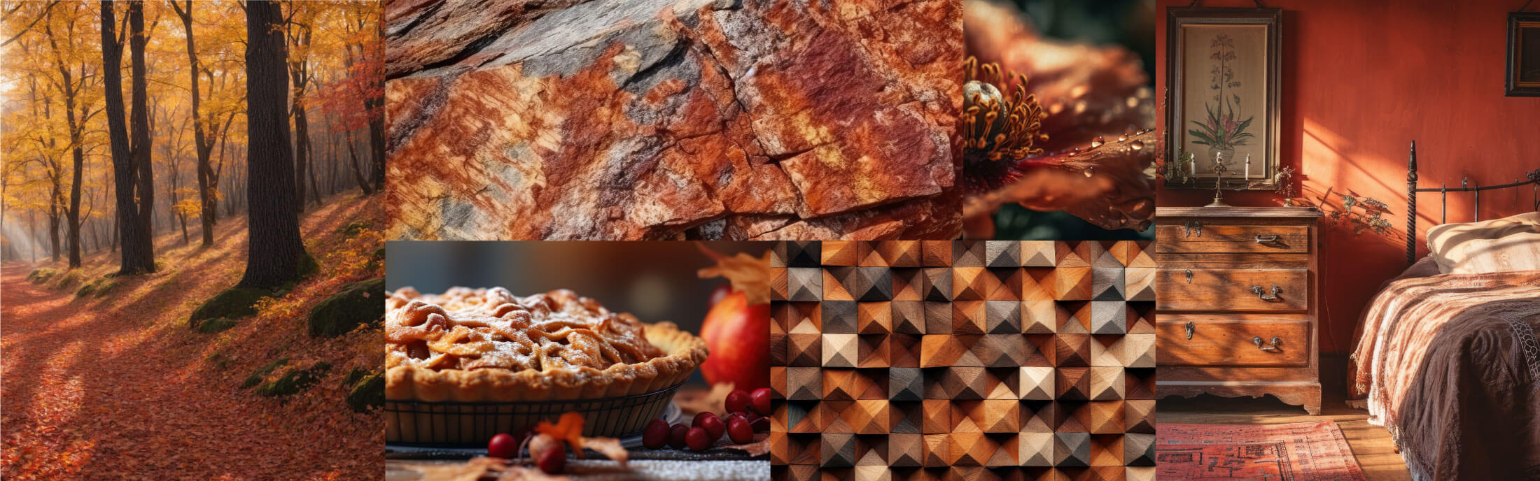
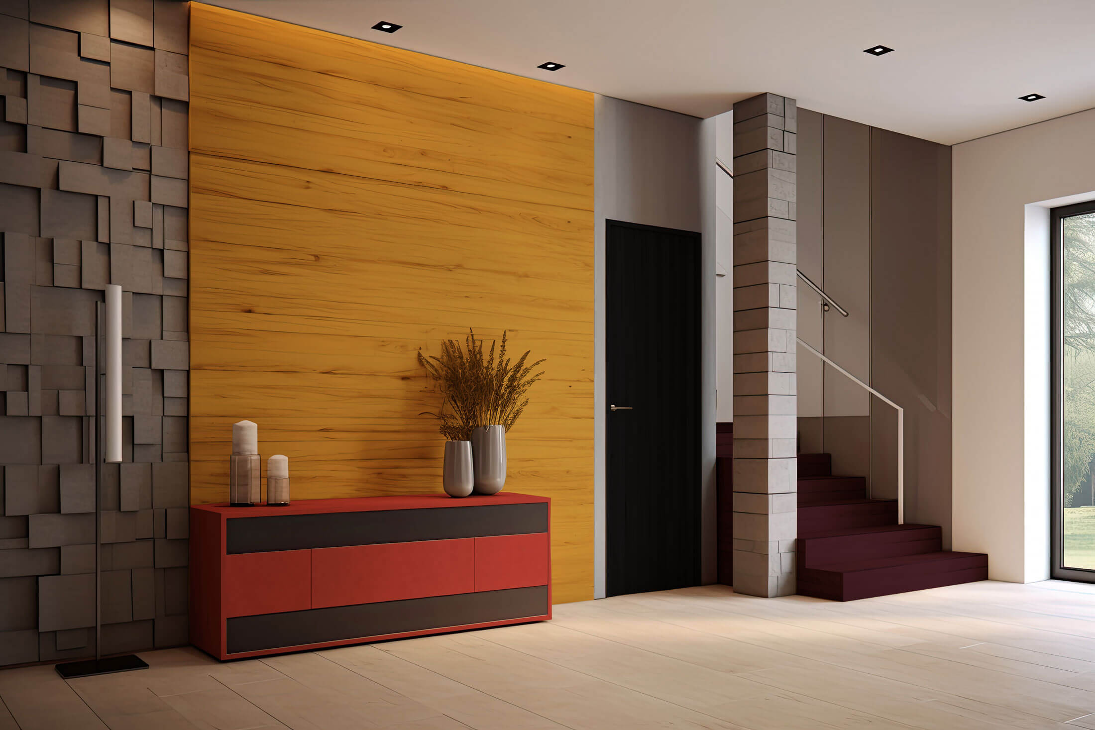
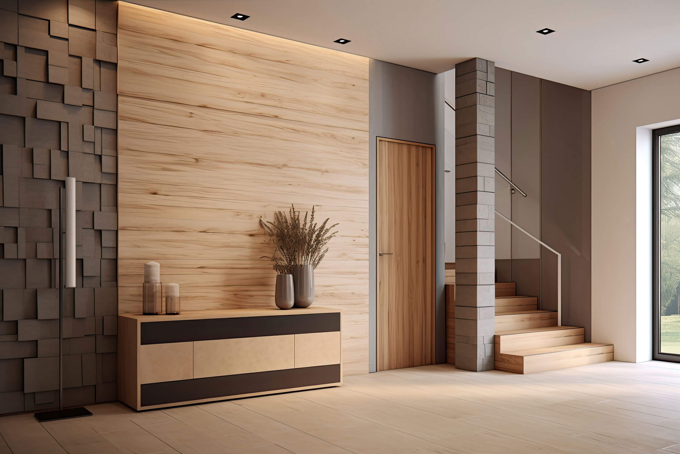
Inner is a colour chart of mature pastels and unusual intertonal shades, recalling our selves with warm, earthy colours and evoking a nostalgic feeling. The nuances are generally combined in warm pairs such as yellow-red or red-blue, with a percentage of white (10-30%) making them easy to combine while still maintaining an interesting contrast.
NCS S4030-Y70R
A soft, burnt brown
NCS S6030-Y90R
A red-brown with character
NCS S2060-Y90R
A soft red embracing us
NCS S2050-Y10R
Deep gold that is luxurious and ecological
NCS S7005-R80B
A bluish neutral that calms
NCS S5020-R20B
A pale violet for pure feelings
Fluid colours reflecting a liquid state of mind that dissolves the boundaries between digital and physical worlds.
Healing from the anxiety of artificial intelligence
Our realities are melting under the impact of artificial intelligence. We wonder who we are and who we want to be. Thus, we explore alternative personalities through our avatars that exist only in an illusory multiverse. This ethereal experience heals anxiety and reflects a rebellion against conservatism.
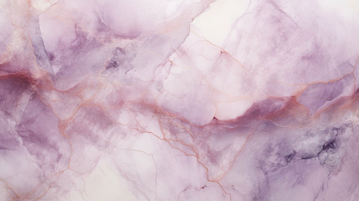
In Ethereal, digital reality introduces us to a world of liquid colours that we wish to incorporate into our physical lives. New sustainable colouring techniques, such as the use of food waste, underline airy tones, reflecting our feelings. These delicate and light colours are ethereal and inspire abstract and sometimes playful shapes. This high-tech mood has a positive impact. The dopamine colour of red marks the beginning or end of this ethereal experience.