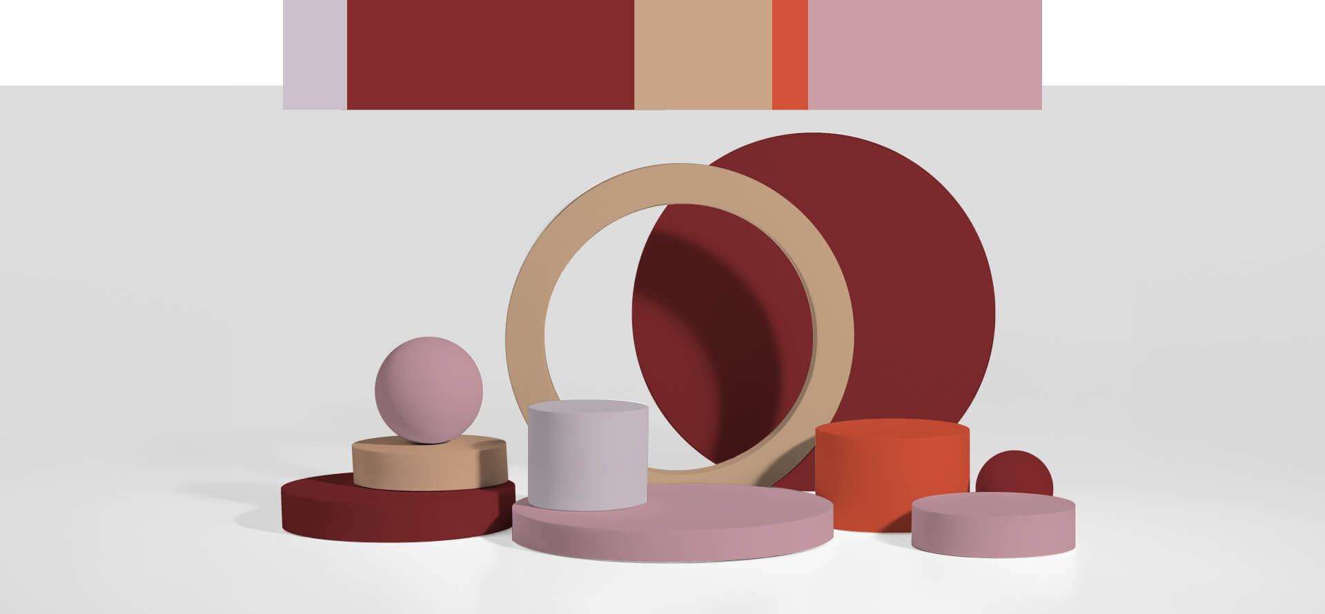
Crimson red
A deep and majestic shade, ideal for highlighting distinct areas. This timeless colour is suitable for a wide range of applications. In furniture, it is recommended for elements that break up and characterise.
Fox red
A contemporary choice for those wishing to make a bold statement. Its lively optimistic energy makes it ideal for details and focal points in any design context. Even a small amount of this colour is usually enough to leave a lasting impression.
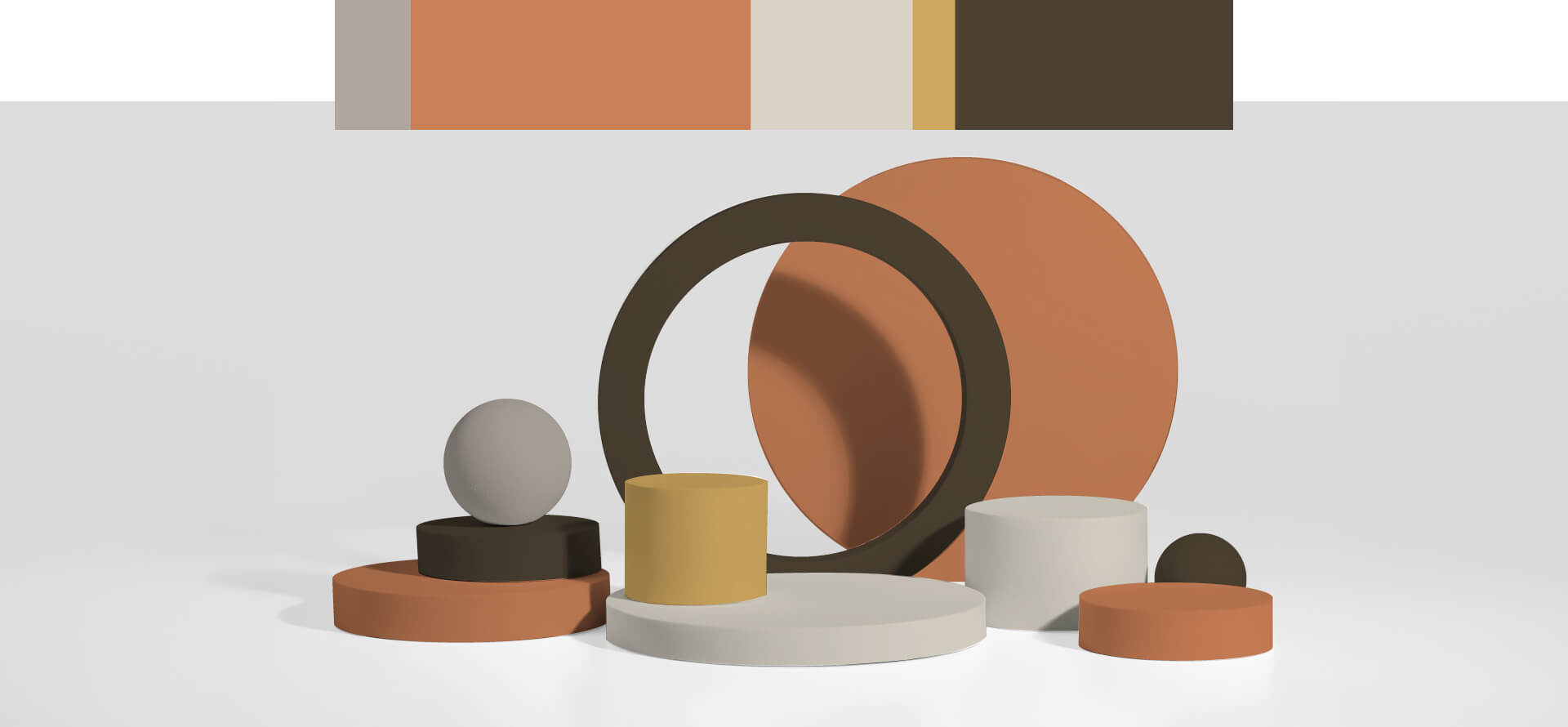
Apricot brown
Balance between modernity and the past. With a cosy and comforting mood, this versatile colour adapts and makes different materials such as graphics, furniture, architecture and fashion dialogue.
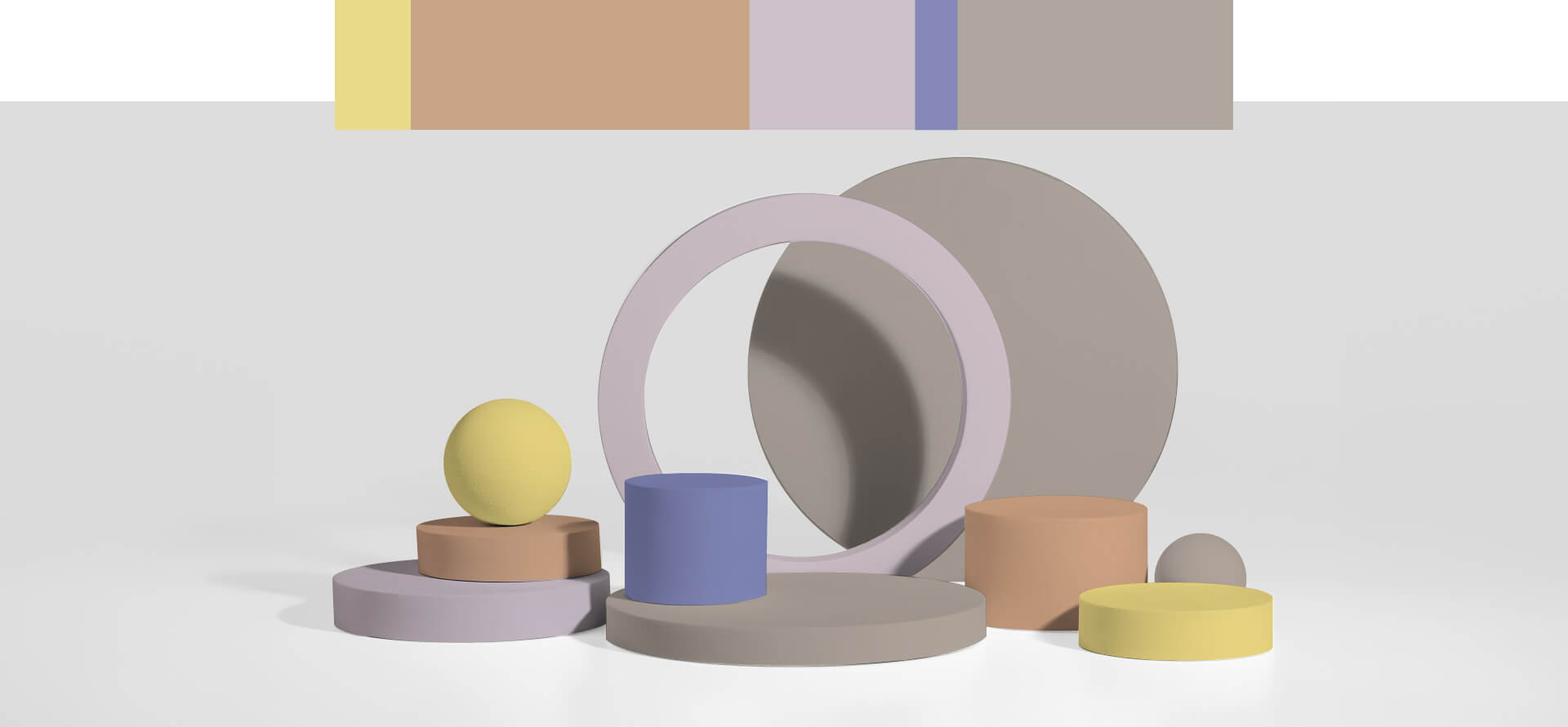
Peanut butter
A warm, relaxed and natural atmosphere, easily combinable with other colours. It is a versatile choice, neutral compared to terracotta and sensual compared to beige and greige.
Mineral brown
It creates a balanced, robust and nurturing atmosphere. This deep, nature-inspired shade might not be chosen at first glance, but over time it adapts beautifully to any finish and scale. Using it with a bit of courage will leave you pleasantly surprised.
Brick yellow
It emanates a warm, optimistic light. It is an excellent and versatile architectural colour. In contrast to brighter yellows, ochre tones like this are stable in various lighting conditions.
Garlic beige
It offers a relaxed atmosphere and visually softens overly lively environments. Despite its name, this delicate colour will never disappoint. It is a contemporary and timeless choice for essentials, but it is advisable to combine it with other brighter colours to add visual interest.
Pepper white
A natural and cosy feel, ideal for interior and product design. Versatile and easy to combine with other colours, it is more relaxing on the eye than pure white. Promoted as a modern classic from 2021, it reflects RAL’s commitment to optimising resources and focusing on concrete improvements without the need for drastic revision.
Natural yellow
Dynamic and optimistic. It should be used with moderation, especially in low light environments, to avoid its energising effect producing the opposite result. However, do not miss the opportunity to use this colour to create exciting and fresh focal points.
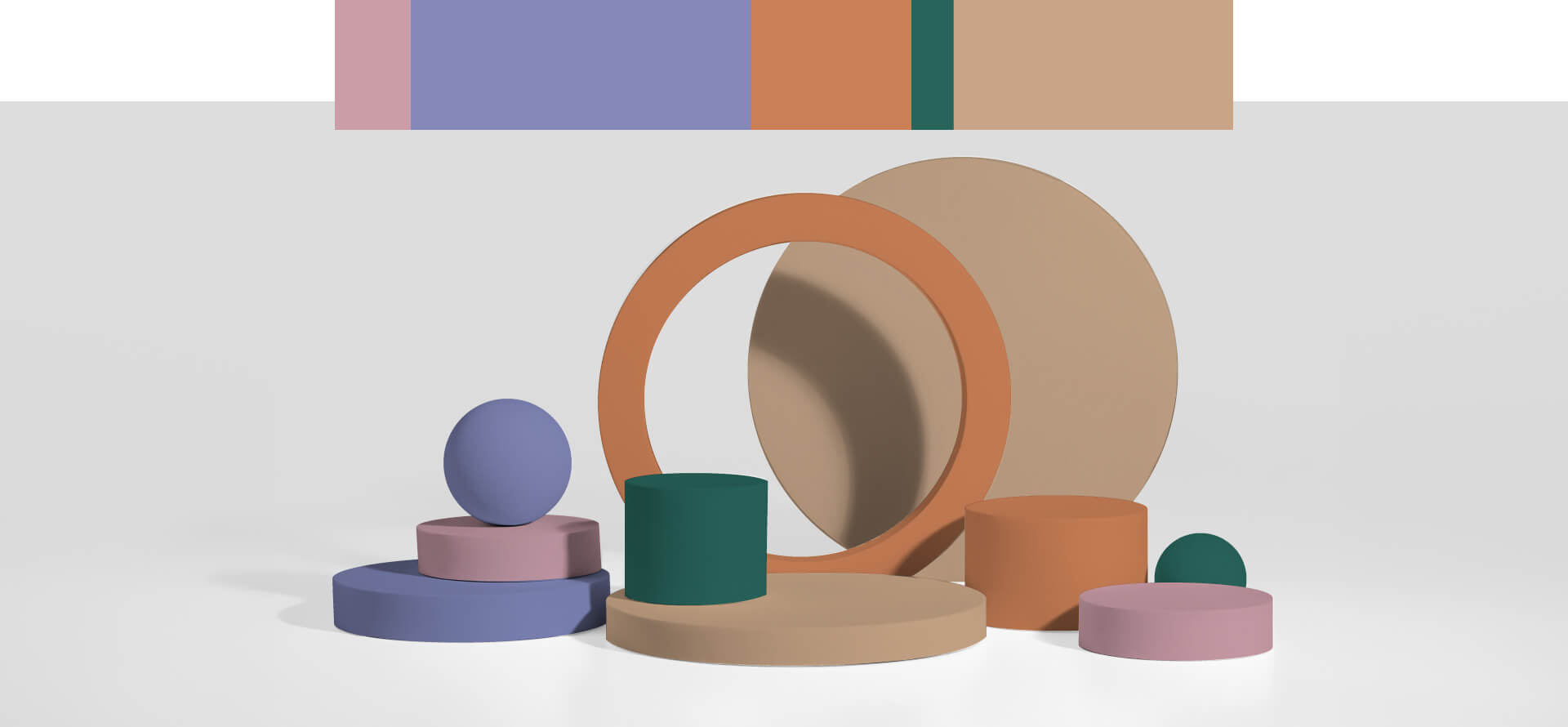
Sand brown
It gives an immediate feeling of relax and warmth, despite the green hue. Easy to combine with other colours, it is a striking choice to replace classic neutrals. Suitable for different scales and lighting conditions.
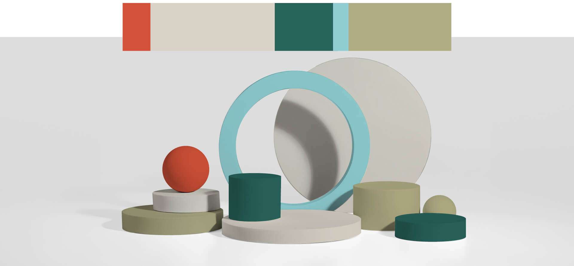
Sea green
For contemporary, solid elegance. Suitable for a wide range of applications, both in product design and interiors, this versatile colour can be used on a large scale without being oppressive.
Summer soft blue
Uplifting, clean and cheerful. It stands out on glossy surfaces and balances earthy palettes excellently. Its brilliance and liveliness make it perfect as an accentuated, fresh colour. It should only be used more extensively in areas where people spend short periods of time.
Opal violet
It offers an intriguing and relaxing space. Visually stable, it stands out with its elegance in an ultra-matt finish. Perfect for accenting specific areas, it can be used generously without being stodgy.
Light violet
A feeling of calmness and sophistication. This versatile colour combines well with other colours, offering an interesting alternative to pure white and light grey. Since 2021, Light Purple has become a modern classic, reflecting RAL’s commitment to optimising resources and focusing on concrete improvements without the need for drastic revision.
Opaline pink
It creates a sensual, inclusive and distinctive atmosphere. It is ideal for highlights and accents. This colour is not common, but it is precisely its distinctiveness that makes it so fascinating and suitable for various applications.